
Developing how you report your data to the coaching/support staff/management can take a lot of time to develop and evolve. Framing your data in a way that is easily digestible, communicates value effectively, and is used to make informed decisions is incredibly important. Below I’ve listed out a few ways one can frame that data to provide context and understanding to a GPS or “team loading” report. While the examples given show GPS metrics, the same concepts can apply to team wellness, force plate measurements, or any other numerical data that is collected from a team.
Individual Day
A stand-alone report that simply reports the values from the day is a simple option that conveys the daily values but with no true comparison to other relative moments in a training week. As seen above, this type of report is fairly simple to understand and see who the significant outliers are on the high-end and low-end. It communicates the information from the day and, depending on what system you are using, will likely adjust the axis so the focus is really comparing the athletes to one-another.

For simple comparison, I like to group my athletes by position so that you can immediately compare who is an outlier within their own positional group. Those playing the same position should have similar loads so if someone is high or low, it stands out a bit more when they are grouped by position. If the entire positional group is high, it was likely due to the unbalanced demand of the drills on that positional group.
Simple reporting is exactly that: simple. It communicates information but does not provide much context compared to any other trainings or matches. These types of reports can be great if you are explaining what metrics mean to a coaching staff or the basics of a report you will later build off of. It’s a good place to start but if we have the ability to provide more context, which will then provide more value, we should.
Relative to match average: team, positional, personal
A slightly more complex way to display information is to compare everything to the match average. Values will vary by team, so it is a way to objectively compare oneself to oneself. It provides a point of reference by which you can pivot around. Now, the question becomes, in your training week, do we want to hit 3x a match value on certain metrics? Should we sprint 1x of what we do in a match in one week? These are questions you have to answer for your own team, but the great thing is it will give you an anchor point to start from whether you are a team that relies on physicality or tactics to adjust training loads appropriately.
There are three ways you can look at an individuals’ metrics when comparing them to match values: team, positional, and personal.
Team: Take everyone who played >85% of the minutes, average out their metrics, and this is your new “Team Average”. You will have highs and lows but it gives you a solid place to start from when defining what the team should do on a daily basis.

Positional: Take the averages from each position of those who played >85% of the minutes and compare your daily data to that. This is my favorite because not all players will play much but because positional demands can vary so much, it still gives objective, relative targets for starters and non-starters to hit regularly.
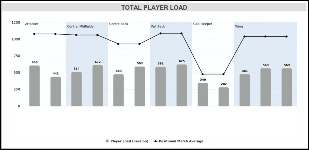
Personal: Take what each individual average when they play >85% of the minutes and compare their daily data to those numbers.
This is highly specific but because not everyone will play often, it’s possible to have no data or only one or two data points on an individual. Also, considering the player-coach ratio of 22:1, individualizing to THAT degree will likely drive one to lose what little sanity is left. It is also unlikely for a coach to get each of the 22 players to hit their marks exactly every week. It’s important to think realistically so in order to maintain enough bandwidth to perform the job optimally.

Relative to that particular “Match Day –“
Another way to contextualize your daily data is to compare it to what athletes typically produce on that particular day during a training week. After about two months in season, we have a good volume of data points when it comes to our weekly schedule, periodization, etc. Our training weeks should start to stabilize as well if we were out of preseason. At this point, we can begin comparing individuals to what they or their positional group usually hit compared to that same “day” of a periodized week. For example, if Athlete A typically averages 350m of High Intensity Distance on Match Day -4, but during this week’s MD-4 he hit 123% of this, his particular bar graph will turn yellow or you can just visually see when it crosses over his particular “average line”.
This is great because you can immediately see post-training if anybody has spiked out of the ordinary in the acute phase. This may not tell us much about how their weekly accumulation looks or their global A:C ratios, but it gives us an immediate snapshot of what happened that day which can cause us to analyze deeper if we see something we don’t like.


This way of visualizing your data is also great for coaches who like to be consistent in their training and if they want their team to feel a sort of “rhythm”. It tells them when they are diverging far from the norm or if the team is hitting their overload or de-load days appropriately.
Similar to comparing your data to match averages, you can look at “Match Day -2” averages by team, position, or individual. They all have their respective advantages. Just make sure the added value is worth the added complexity.
However you arrange your data, make sure those reading it understand it. Make sure trends are recognized and understood and you reference them. When describing how you’ve planned the week out or what you would suggest, constantly refer back to the same context you use in your report to ensure its value sticks and the staff stays on the same page.
