Whether you are beginning a new job, new season, or have access to new tech, it’s important to filter what information we deliver to others and how it is organized. Information needs to be delivered to the appropriate people and in easy-to-digest ways that actually contribute to decisions being made. As a young coach, I produced reports that had lots of information and were very detailed. However, how valuable or digestible was this information? Not nearly as much as I thought at the time. Below I outline a simple checklist you can go through to examine if what you are delivering to your coaches, management, etc. is appropriate or should be revised.
- Does it keep the main thing the main thing?
With any report, make sure you can readily and simply explain why that information is important and pertinent to the athletes’ performance. I work in soccer. I need to make sure that whatever I am reporting on directly relates to their performance on the soccer field. Should I report to management and coaches that our top 3 prospects all have deadlift PRs that are >300 lbs? While strength is great, it’s not a simple task to explain to coaches why we’re going to win more games with that. However, showing them an increase in impulse on their jumps is very easy to digest and explain why it is going to help that athlete be more explosive.
- Will it be used to make informed decisions?
At the beginning of every season, I have my athletes fill out a survey that tells me several seemingly random pieces of information about them. Are they coffee drinkers? What are the three meals that they are most proud of cooking? Are they early or late sleepers? It’s a collection of somewhat informal information that could help explain behavior that I will likely learn about by mid-season, so I just say hey, let’s find it out early. It can help us encourage positive habits and have targeted conversations over the course of the early months of the season. However, I don’t report this to the coaching staff because I don’t think any decisions should be made based off of this information, at least initially. It’s insight, but it’s not something that should make us treat anyone any differently in the acute phase.
- Are outcomes/thresholds defined?
Wellness questionnaires are everywhere these days and tell us incredibly valuable information. However, what level of alarm do we give to certain numbers or number combinations? If a cumulative score is less than 24, it tells us that we may need to alter that person’s plan for the day. By having thresholds in place prior to running into an issue, it allows us to stay consistent and frees up our own mental capacity to not instinctively react to 500 different things in one morning. It allows us to be efficient with our time as a performance staff and relieves our process of ambiguity.

- Is the information redundant? Does it tell a story we already know?
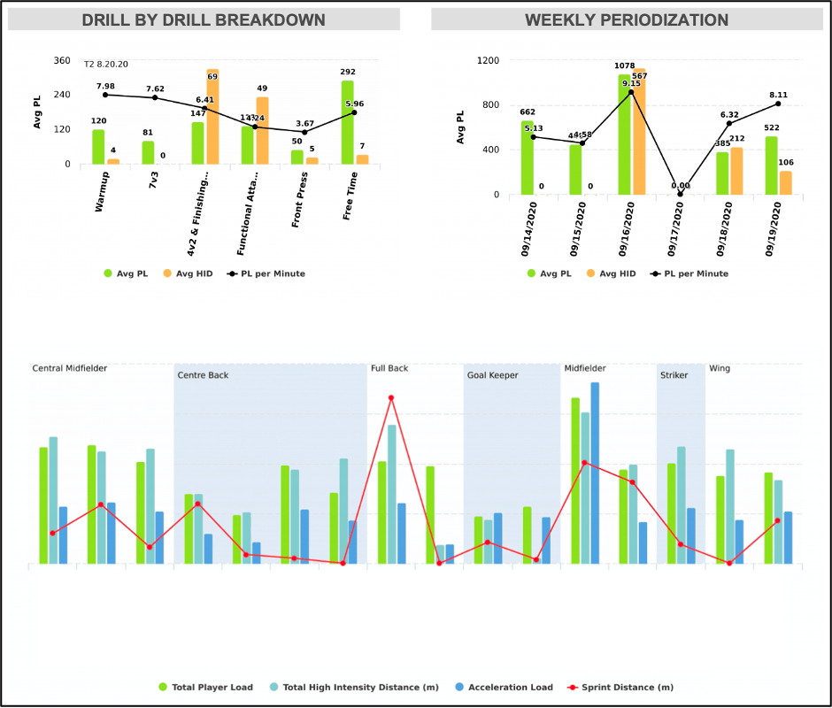
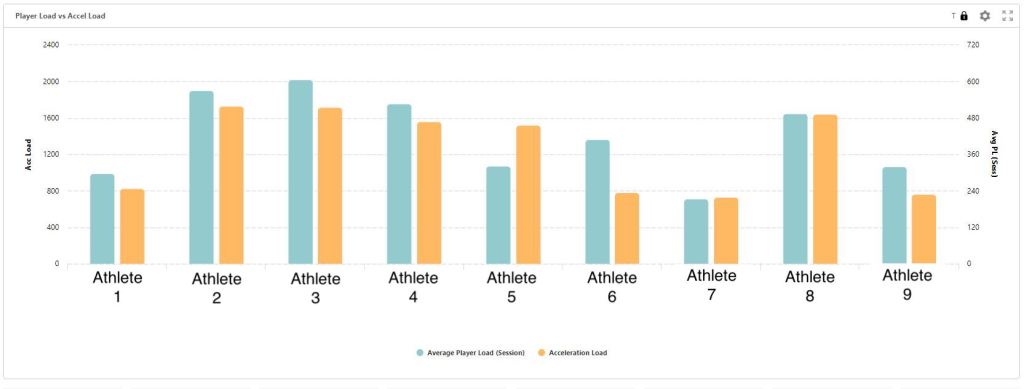
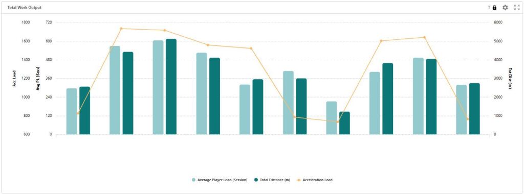
When I first started working with Catapult, I was wide-eyed with all the metrics at my disposal and wanted to show everything. What I realized over time though, is that some metrics almost always fall perfectly in line with one-another. Player Load and Acceleration Load are two of these metrics. 99% of the time, if someone is leading the group in PL, they are also leading the group in Accel Load (unless they did steady state conditioning during rehab). Does including both in a report give the coaching staff more to objectively use? Or does it muddle the report and decrease the attention given to all of the reported metrics.
- Can you explain it simply? Do the decision-makers understand it?
I was helping a colleague redesign his GPS report once. It was a dazzling display of metrics and colors and thresholds. My colleague is incredibly smart and, as he explained his thought process, I sat there in awe. However, I also had trouble grasping a few of the concepts he was describing. Why did he put these three metrics on one graph? How should I interpret a particular combination of metrics that Player 1 is displaying compared to Player 2? After nearly 15 minutes I had a clearer understanding of the concept but only slightly. I asked more information about his coaching staff and learned that this is the first year they had ever seen a GPS report.
Bluntly stated, if a fellow performance coach has trouble absorbing and interpreting the data you are presenting them, it may not be appropriate to deliver to departments who have less of an understanding of those metrics. Should you track it on your own? Go for it! But once again, in most reports, we are after efficient communication and want to avoid muddling the waters with too many complex concepts.
- Is it ACTUALLY used to make decisions?
Great, your report passed all 5 criteria with flying colors. You’ve sent it to management and coaching staffs for several weeks/months. Now, what’s the effect of those reports? How many conversations has it stimulated? How many times has the report been cited by staff members? How many questions have you received about it? And finally, the big question, has it actually been used to make decisions? If it isn’t, it might be time to spend your valuable time elsewhere, instead of creating that report.
Look at the team as a whole. There are likely areas that could use a bit more of your time. There are likely lines of communication that could improve between you and the various people/groups you support. Focus your attention elsewhere and have an even greater effect.
Finally, if the report is not actually being utilized, have a meeting with those involved. Ask questions to find out what is confusing, redundant, or not valuable. Ask them openly for their opinion on the topic matter and see if you can tailor it a bit more to their likes/dislikes. People have biases and if you make a bit of effort to make the report even look more attractive to the individual you’re delivering it to, it’s likely they will look at it more closely and perceive it as more valuable.
Improve your reporting. Simplify it and you will likely see an uptick of support for it and it being used. Don’t put something together because you think it shows how smart you are. There is a lot of beauty in simplicity and communicating efficiently. Keep striving for it.
